MoodMap - UI/UX
Company
MoodMap
My Role
User Experience, User Interface, Prototyping.
Projects
This is my first project I’ve had as UI/UX for an app building. The process was for an HR app that would give the oppurtunity to give a review on how your day was.
Result
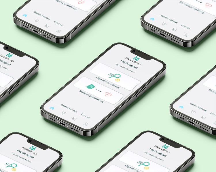
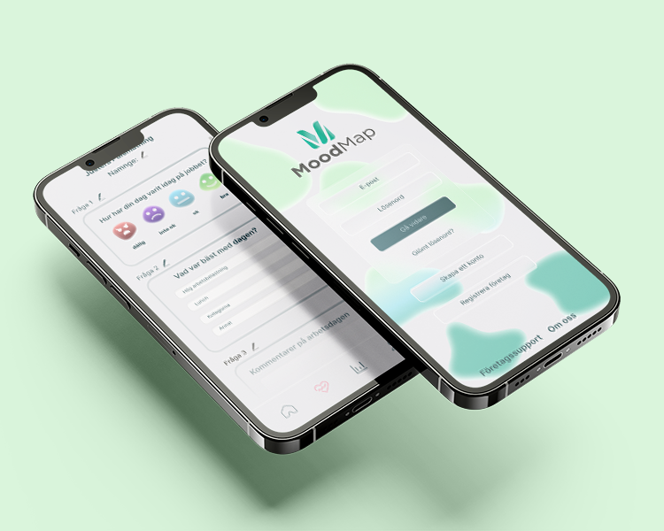
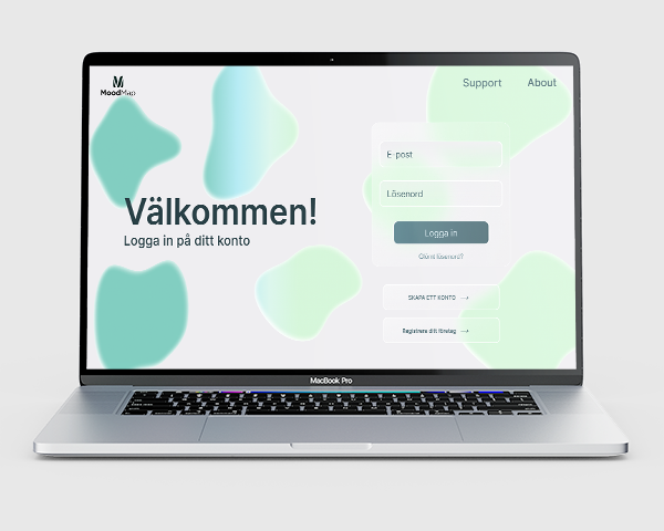
The result end up really nice and the design was very according to their vision. The green colour is to indicate peace and relaxing state and the app is built in a very simple way. The smooth borderless bubbles are organic shapes that symbolises that everyone is not the same and that we have diffrerent moods showed with colours (light or dark green).
The app
Process
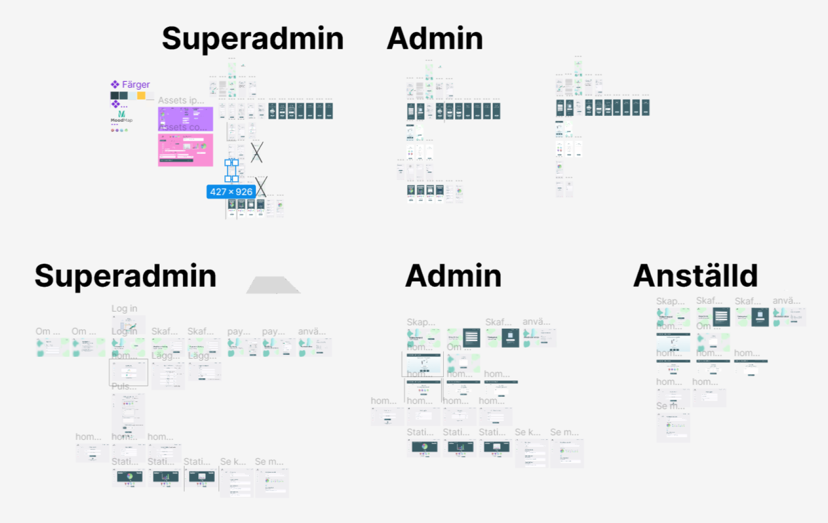
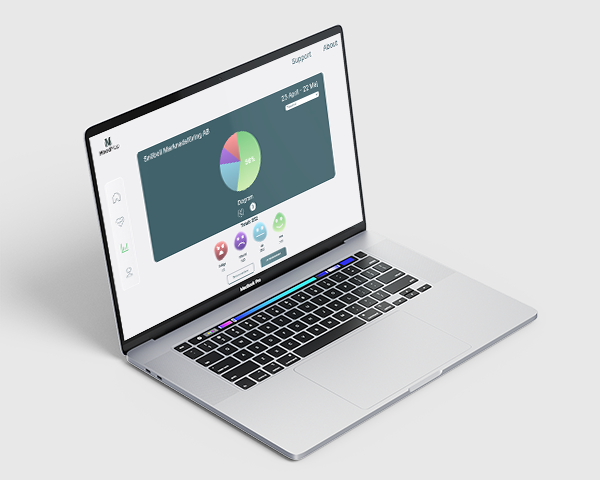
The apps process had to be split into different groups, superadmin, admin and user. This was very important for the entire structure for the app to function. As presented above it was a lot of different pages that are all customized for the different functions of the app,
